

Python Data Visualization with Matplotlib: Complete Tutorial
Master the essential chart types in Python: bar charts, line charts, scatter plots, and pie charts with step-by-step examples and code samples.
Data visualization is crucial for understanding patterns, trends, and insights in your data. In this comprehensive tutorial, you’ll learn how to create professional charts using Python’s most popular plotting library, Matplotlib. We’ll cover the four essential chart types every data analyst should master: bar charts for comparisons, line charts for trends, scatter plots for relationships, and pie charts for proportions.
Prerequisites and Setup
Before diving into chart creation, ensure you have the required Python libraries installed. These two packages provide all the functionality needed for data visualization and numerical operations.
pip3 install matplotlib
pip3 install numpy
Creating Bar Charts for Data Comparison
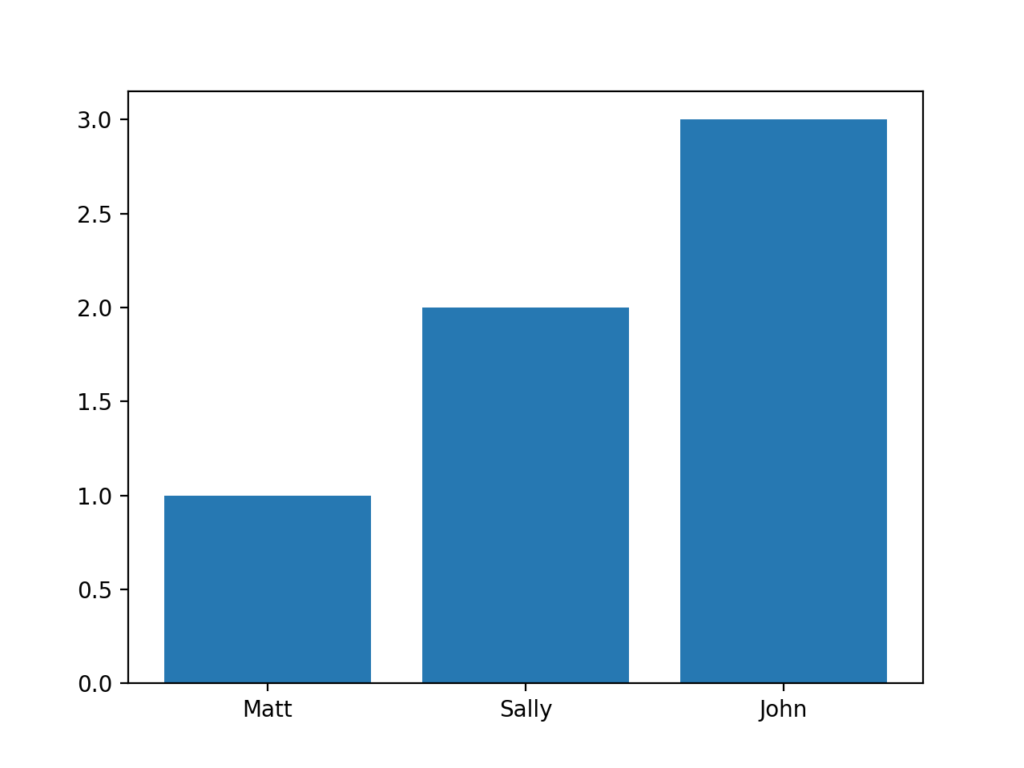
Bar charts excel at comparing discrete categories or values. They’re perfect for visualizing survey results, sales figures, or any data where you want to compare quantities across different groups. In this example, we’ll create a simple comparison of weekly walking distances.
import matplotlib.pyplot as plt

# Create a list showing how many miles each person walked
values = [1, 2, 3]

# Create a list of names
names = ["Matt", "Sally", "John"]

# Declare bar chart
plt.bar(values, values)

# Associate the names with the values
plt.xticks(values, names)

# Show the bar chart
plt.show()
The code above creates a simple bar chart comparing walking distances. The plt.bar() function creates the bars, while plt.xticks() labels each bar with the corresponding person’s name.
Line Charts for Trend Analysis
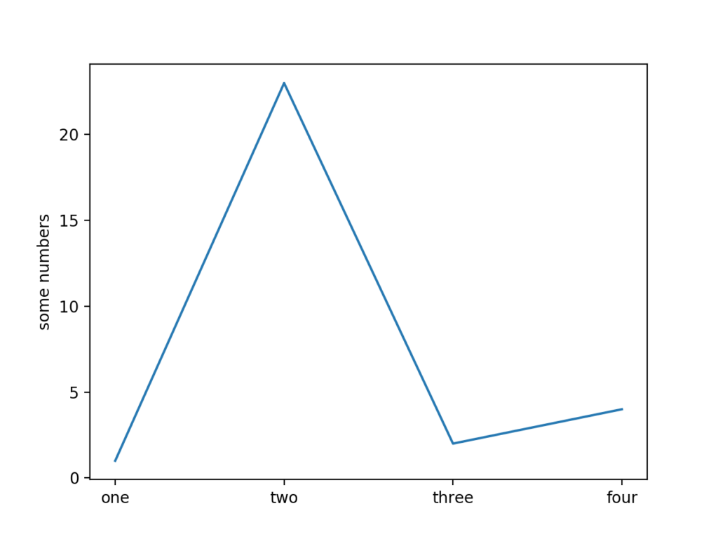
Line charts are ideal for displaying data changes over time or showing relationships between continuous variables. They help identify trends, patterns, and correlations in your data. The connected points create a visual flow that makes trends immediately apparent.
import matplotlib.pyplot as plt

# Declare line chart and pass in Y values for line
plt.plot([1, 23, 2, 4])

# Declare the X values for the chart and assign labels to each point
plt.xticks([0, 1, 2, 3], ["one", "two", "three", "four"])

# Assign a label to show on the left side of the chart
plt.ylabel('some numbers')

# Draw the chart
plt.show()
This example demonstrates how plt.plot() creates a line connecting data points. The plt.ylabel() function adds a descriptive label to the y-axis, making the chart more informative.
Scatter Plots for Relationship Discovery
Scatter plots are powerful tools for exploring relationships between two variables. They help identify correlations, clusters, outliers, and patterns that might not be obvious in raw data. Each point represents a pair of values, making it easy to spot trends.
Individual Point Method
import matplotlib.pyplot as plt

# Draw individual points on the chart
plt.scatter(1, 2)
plt.scatter(2, 3)
plt.scatter(3, 5)
plt.scatter(4, 3)

# Show the scatterplot
plt.show()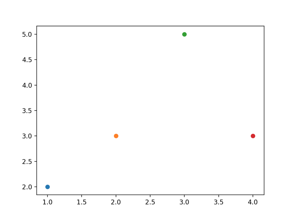
Array-Based Method (Recommended)
For efficiency and cleaner code, it’s better to pass arrays of coordinates to the scatter plot function:
import matplotlib.pyplot as plt

# Declare arrays showing the X and Y coordinates
x = [1, 2, 3, 4, 5, 6, 7]
y = [1, 3, 3, 2, 5, 7, 9]

# Pass all the points into the scatter plot
plt.scatter(x, y)

# Show the scatterplot on the screen
plt.show()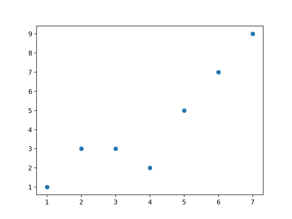
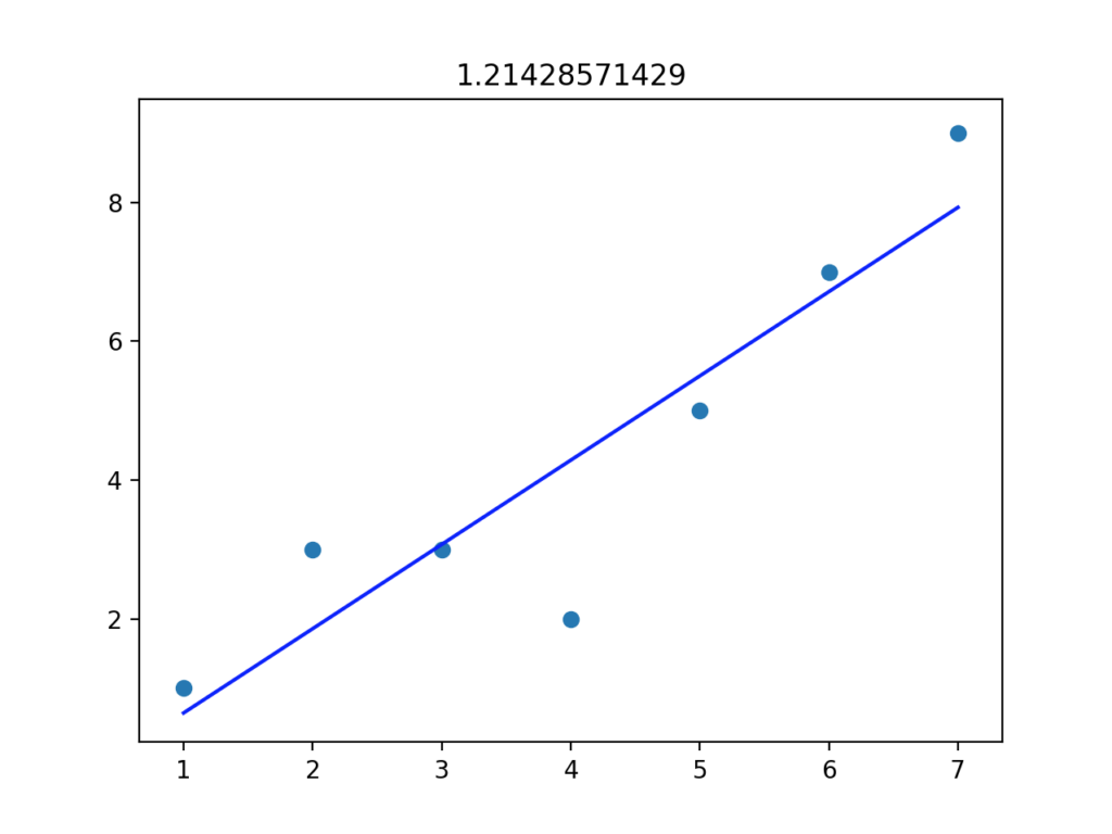
Adding Trend Lines to Scatter Plots
When scatter plot points show a pattern, adding a trend line helps visualize the relationship more clearly. NumPy provides powerful functions for calculating linear regression and creating best-fit lines through your data points.
💡 Pro Tip: NumPy’s polyfit() function calculates the best-fit line coefficients, while poly1d() creates a polynomial function for generating trend line coordinates.
import matplotlib.pyplot as plt
import numpy as np

# Declare arrays showing the X and Y coordinates
x = [1, 2, 3, 4, 5, 6, 7]
y = [1, 3, 3, 2, 5, 7, 9]

# Create scatter plot
plt.scatter(x, y)

# Calculate trend line coefficients
m, b = np.polyfit(x, y, 1)

# Create trend line
plt.plot(x, [m*i + b for i in x], color='red', linestyle='--', linewidth=2)

# Add labels
plt.xlabel('X Values')
plt.ylabel('Y Values')
plt.title('Scatter Plot with Trend Line')

# Show the plot
plt.show()

# Print the correlation strength
print(f"Slope: {m:.2f}, Intercept: {b:.2f}")
This enhanced version adds a red dashed trend line that clearly shows the data’s upward trend. The slope and intercept values help quantify the relationship strength.
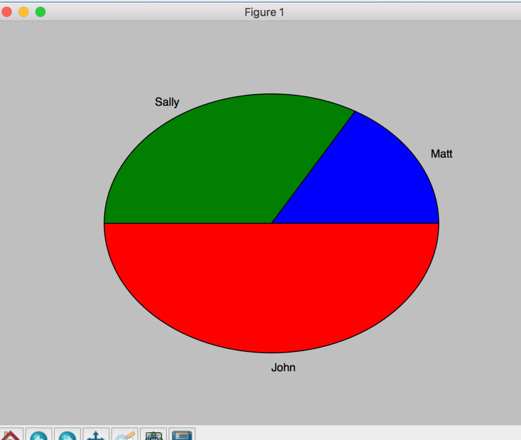
Pie Charts for Proportional Data
Pie charts effectively show how individual parts contribute to a whole. They’re perfect for displaying percentages, market share, budget allocation, or any data where the total equals 100%. Each slice represents a proportion of the complete dataset.
Basic Pie Chart
import matplotlib.pyplot as plt

# Create list of values
values = [1, 2, 3]

# Create a list of names
names = ["Matt", "Sally", "John"]

# Declare pie chart
plt.pie(values, labels=names)

# Show pie chart
plt.show()
The basic pie chart automatically calculates proportions and assigns different colors to each slice. Labels are positioned around the chart for easy identification.
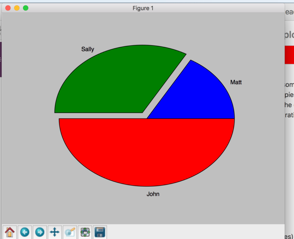
Exploded Pie Chart for Emphasis
To highlight specific data segments, you can “explode” slices by pulling them away from the center. This technique draws attention to important categories or outliers in your data.
# Exploded pie chart
import matplotlib.pyplot as plt

# Create list of values
values = [1, 2, 3]

# Create a list of names
names = ["Matt", "Sally", "John"]

# Define explosion distances (0 = no explosion, 0.1 = slight separation)
explode = (0, 0.1, 0)

# Create exploded pie chart
plt.pie(values, explode=explode, labels=names, autopct='%1.1f%%')

# Show pie chart
plt.show()
The exploded version separates Sally’s slice from the main chart, creating visual emphasis. The autopct parameter adds percentage labels to each slice.
Key Takeaways and Next Steps
You now have the fundamental skills to create four essential chart types using Python and Matplotlib:
- Bar charts for comparing discrete categories and values
- Line charts for showing trends and changes over time
- Scatter plots for exploring relationships between variables
- Pie charts for displaying proportional data and percentages
These visualization techniques form the foundation for more advanced data analysis and presentation. As you continue developing your Python skills, consider exploring Python functions and project management with requirements.txt to build more sophisticated data visualization applications.
Elevate Your IT Efficiency with Expert Solutions
Transform Your Technology, Propel Your Business
Unlock advanced technology solutions tailored to your business needs. At InventiveHQ, we combine industry expertise with innovative practices to enhance your cybersecurity, streamline your IT operations, and leverage cloud technologies for optimal efficiency and growth.