

Pandas is one of the most powerful and popular Python libraries for working with data. It’s widely used by data analysts, scientists, and engineers to clean, explore, and manipulate structured data.
With Pandas, you can easily load data from files or the web, filter specific values, reshape datasets, summarize statistics, and even generate visualizations. Whether you’re working with spreadsheets, databases, or time series data, Pandas gives you the tools to make your work easier and faster.
In this tutorial, we’ll start by installing Pandas and then walk through beginner-friendly examples of common use cases—loading data, filtering, plotting, pivoting, and summarizing. No previous experience with Pandas is required.
What is Pandas?
Pandas is a powerful Python library used for data analysis and manipulation. It provides easy-to-use tools to work with structured data, such as tables or spreadsheets, directly within your Python code.
At the core of Pandas are two primary data structures:
- Series – A one-dimensional labeled array, similar to a column in a spreadsheet or a single list of values.
- DataFrame – A two-dimensional labeled data structure, like an Excel sheet or a SQL table, where each column can be a different data type (numbers, text, dates, etc.).
Example:
import pandas as pd

# A Series
series_example = pd.Series([10, 20, 30])
print(series_example)

# A DataFrame
data = {
    'Name': ['Alice', 'Bob', 'Charlie'],
    'Age': [25, 30, 35]
}
df = pd.DataFrame(data)
print(df)
With just a few lines of code, you’ve created structures that are ready for filtering, math, grouping, visualization, and more.
Pandas Works Well With:
- Tabular data (like CSVs, Excel files, and SQL tables)
- Time series data (stock prices, web traffic logs)
- Matrix-style data (with labeled rows and columns)
- Statistical or observational datasets (used in research or data science)
Pandas is built on top of NumPy, which means it’s both efficient and integrates easily with scientific libraries like matplotlib and scikit-learn. Even if you’re just getting started with Python, Pandas gives you the power to analyze real-world data right away.
What is Numpy?
Before diving too deep into Pandas, it helps to understand NumPy, short for Numerical Python. Pandas is actually built on top of NumPy, and many of its core features depend on NumPy under the hood.
NumPy makes working with numbers and arrays in Python much faster and more efficient. It introduces a new kind of data structure called a NumPy array, which is like a supercharged version of a Python list.
Why is NumPy useful?
Here are a few things NumPy does really well:
- Efficient storage and manipulation of large numerical datasets
- Performing math on entire arrays at once (vectorization)
- Working with multi-dimensional data (like matrices or grids)
- Advanced indexing and filtering
Example:
import numpy as np

# A simple NumPy array
arr = np.array([1, 2, 3, 4, 5])
print(arr * 2)  # Output: [ 2  4  6  8 10]
With NumPy, you don’t need to write loops to multiply each number—just write arr * 2, and NumPy handles the rest. This kind of operation is not only simpler, it’s much faster, especially with large datasets.
While Pandas handles more complex, labeled data (like spreadsheets), it uses NumPy under the hood to do the heavy lifting. If you’re using Pandas, you’re already benefiting from NumPy—no need to master it first, but it’s good to know it’s there.
Installing Pandas
To get started with Pandas, you need to install it on your computer. The easiest way is to use Python’s built-in package manager called pip.
Install with pip
If you’re using Python 3, run this command in your terminal or command prompt:
pip3 install pandas
If you’re using Python 2 (which is not recommended, since it’s no longer supported), you would run:
pip install pandas
✅ Tip: If pip isn’t installed on your machine, check out our Python Basics guide for how to set it up.
Optional: Use Anaconda
Another popular option is to install Anaconda, a distribution that includes Pandas along with other useful tools for data science like NumPy, Jupyter Notebooks, and matplotlib.
If you’re working with large datasets or want an all-in-one setup, Anaconda is a great choice.
You can download it here: https://www.anaconda.com/products/distribution
Once Pandas is installed, you’re ready to start working with real data! Let’s jump into how to load and explore data using Pandas next. Ready?
Using Pandas
To help you learn Pandas through hands-on experience, we’ll walk through a real-world dataset: the 2016 U.S. presidential polling data published by FiveThirtyEight. This dataset includes poll results from various organizations across all 50 states.
You don’t need to download the data in advance—we’ll load it directly from the web using Pandas. However, if you plan to run the script multiple times or want faster performance, downloading the file locally is a good idea.
What You’ll Learn
In this example-driven section, we’ll explore some of the most common and useful features of Pandas:
- Filtering data – Focus on the rows you care about
- Summarizing data – Calculate averages, counts, and other stats
- Plotting data – Create basic visualizations to spot trends
- Pivoting data – Reshape your dataset for better insights
Let’s begin by importing the libraries we’ll use throughout the tutorial:
import pandas as pd        # Core data analysis library
import matplotlib.pyplot as plt  # For plotting graphs
import numpy as np         # For numerical operations
Next, we’ll load the CSV file directly from the FiveThirtyEight website into a Pandas DataFrame:
# Load polling data into a DataFrame
df = pd.read_csv("http://projects.fivethirtyeight.com/general-model/president_general_polls_2016.csv")
Once loaded, df will contain all the polling data—including columns like state, pollster, population type (e.g. likely voters), candidate names, and adjusted poll numbers.
You can take a quick look at the first few rows using:
print(df.head())
This will give you a feel for the structure of the dataset before we dive into filtering and analyzing it.
Filtering Data in Pandas
Once you’ve loaded your dataset, you may notice that it contains a lot of information—more than you need all at once. Viewing everything with print(df) is rarely helpful, especially with large datasets. Instead, Pandas makes it easy to filter down to just the rows that matter.
Let’s say you’re only interested in polling data from California, conducted by a specific pollster like YouGov. You can apply filters to isolate those records using a simple Boolean condition.
Here’s how to do it:
# Filter the DataFrame to only include YouGov polls from California
df_filtered = df[(df["state"] == "California") & (df["pollster"] == "YouGov")]
What’s happening here:
df["state"] == "California"filters rows where thestatecolumn equals"California"df["pollster"] == "YouGov"filters for rows where thepollstercolumn equals"YouGov"- The
&operator combines both conditions using a logical AND
Together, this returns a new DataFrame df_filtered that only contains rows meeting both criteria.
View the Filtered Results
You can inspect the filtered results using .head() again:
print(df_filtered.head())This gives you a quick look at the first few entries that match your filter.
Filtering is a foundational skill in data analysis. Once you’ve narrowed your data down to what matters, it becomes much easier to visualize trends, calculate summaries, or build insights.
Plotting
Next, let’s plot the poll results of both Trump and Clinton:
df_filtered["adjpoll_clinton"].plot()
df_filtered["adjpoll_trump"].plot()
plt.show()
Your result should look something like this:
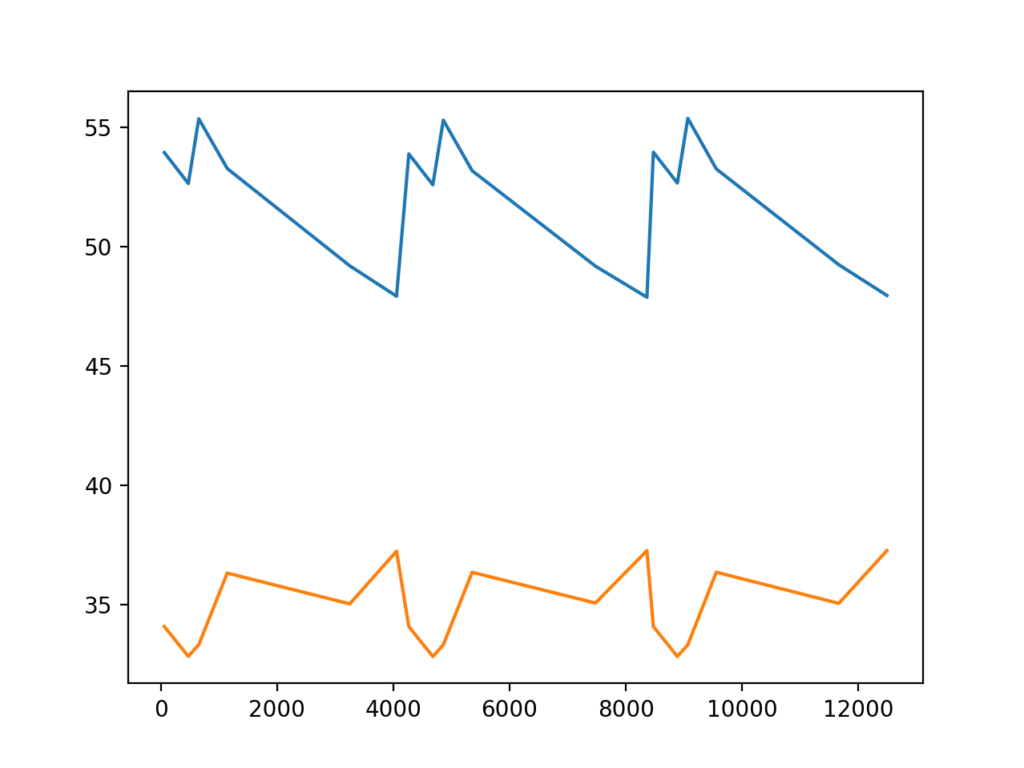
That is useful. But it would be more helpful if we could add some labels
We can add the legend parameter to identify each line:
df_filtered["adjpoll_clinton"].plot(legend=True)
df_filtered["adjpoll_trump"].plot(legend=True)
your chart should now look more like this:
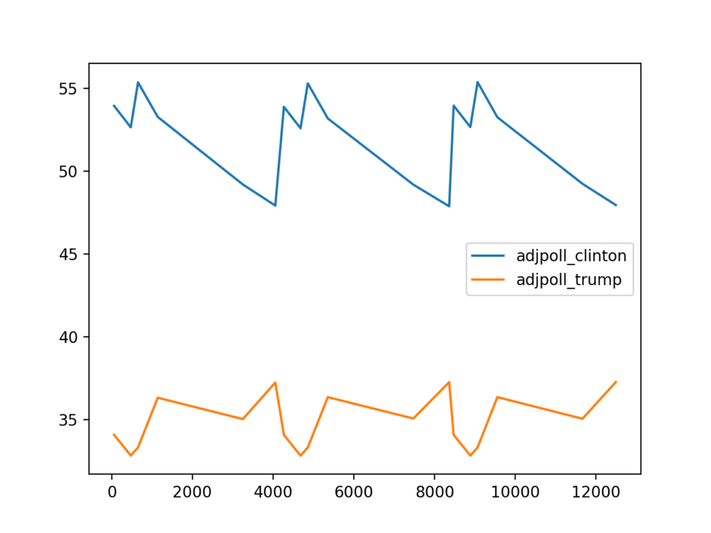
That looks even better. When we start going beyond this point, I think it is a lot easier to use matplotlib directly to do more plotting. Here is a similar plot done using matplotlib:
import pandas as pd
import matplotlib.pyplot as plt
import numpy as np

df = pd.read_csv("http://projects.fivethirtyeight.com/general-model/president_general_polls_2016.csv")
df = df.sort_values ('startdate',ascending=False)
plt.plot(df['startdate'],df['adjpoll_clinton'])
plt.plot(df['startdate'],df['adjpoll_trump'])
plt.legend()
plt.ylabel('Approval')
plt.xticks(rotation=45)

plt.show()
Here is the result:
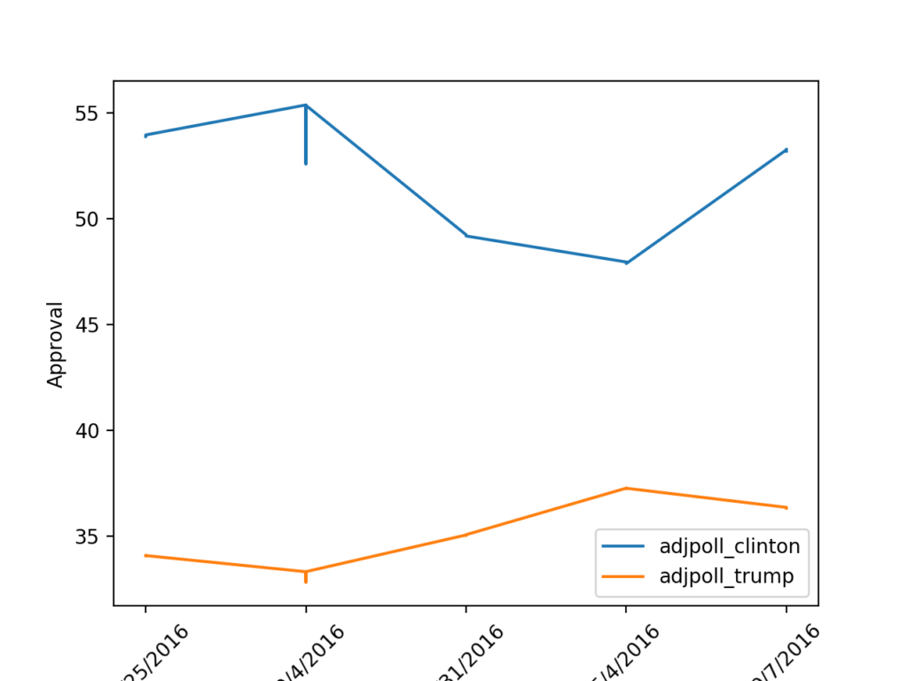
As you can see above, we start by importing our libraries, then reading our csv file. We then sort our values based on the date of the poll, then we plot both the Clinton and trump approval ratings. We add a legend by calling plt.legend(). We add the label on the left side of the graph using the plt.ylabel command. We then rotate the dates along the bottom by 45 degrees with the plt.xticks command. Finally we show our graph with the plt.show() command.
When you do plotting, Pandas is just using matplotlib anyway. So what we have done is stepped back and done it outside of pandas. But it is still using the same libraries.
Also See: Python objects and classes!
Pivoting
Pivoting data is when you take the columns and make them the rows and vice versa. It is a good way to get a different perspective on your data. And it is better than simply tilting your head to the left. We will use the same dataset as the previous section in our examples. Just like before, we will start by importing our libraries:
import pandas as pd
Next we read our CSV file and create our data frame:
df = pd.read_csv("http://projects.fivethirtyeight.com/general-model/president_general_polls_2016.csv")
Next we want to see what Registered Voters are saying vs Likely Voters in our samples. So we are going to Pivot using the population column as our column list:
df.pivot(columns='population',values='adjpoll_clinton')
Your output should look similar to this:
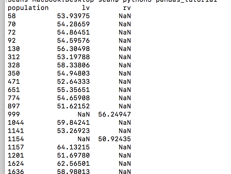
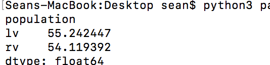
Using this pivot table you can see the approval ratings for Clinton among likely voters and registered voters. Those NaN’s get in the way, so let’s get the average of each column:
df.pivot(columns='population',values='adjpoll_clinton').mean(skipna=True)
In the above command we added the .mean() function with the skipna=True option. This takes the average of each column, but skips all of the NaN values.
Your output should look similar to this:
Here is all of our pivot table code consolidated:
import pandas as pd

df = pd.read_csv("http://projects.fivethirtyeight.com/general-model/president_general_polls_2016.csv")

#Filter to only show data from the state of California
df=df[(df.state=='California')]

#Pivot to show the lv/rv data as the columns
print(df.pivot(columns='population',values='adjpoll_clinton'))

#Show the averages for lv and rv (registered voters, likely voters)
print(df.pivot(columns='population',values='adjpoll_clinton').mean(skipna=True))
Summarizing
It can be taunting to look at a large dataset. However, Pandas gives you some nice tools for summarizing the data so you don’t have to try to take on the entire dataset at once.
To start, we have the min, max and median functions. These functions do as they say and return the minimum, maximum, and average values. You can see examples of each below using our Pivot Table from the previous section:
df.pivot(columns='population',values='adjpoll_clinton').mean(skipna=True)
df.pivot(columns='population',values='adjpoll_clinton').max(skipna=True)
df.pivot(columns='population',values='adjpoll_clinton').min(skipna=True)
Next it might be helpful to know the number of unique values you have in a dataset:
df.pivot(columns='population',values='adjpoll_clinton').nunique()
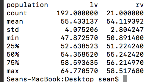
Or if you just want a quick summary, you can use the describe function:
df.pivot(columns='population',values='adjpoll_clinton').describe()
The output of the describe function is the most useful as it combines many of the previous functions we talked about. Your output will look similar to this:
Summary
Pandas is an essential tool for anyone working with data in Python. In this beginner-friendly tutorial, you learned how to install Pandas, understand its core concepts like DataFrames and Series, and use it to load and explore real-world datasets.
We covered how to:
- Filter data to focus on what matters
- Create visualizations using Pandas and Matplotlib
- Use pivot tables to compare groups in your dataset
- Summarize key statistics using built-in Pandas functions
Whether you’re analyzing polling data, sales figures, or survey results, Pandas makes it easy to wrangle and understand your data. If you’re just starting out, continue practicing with different datasets—try filtering, pivoting, and visualizing to deepen your understanding.